design work
This is a brand identity concept for a fictional alternative rock festival called ‘Til Our Ears Ring. The lineup for this festival includes artists from different eras of the alternative rock genre, so it was crucial to create a design that fit every artist so their inclusion didn’t feel out of place. Another big objective was to design a brand and festival that caught the attention of all fans of alternative rock, not just one group of people.
The ‘Til Our Ears Ring brand is striking visually and packs a punch. It uses a bright color palette, bold typeface, and consists of illustrations that capture the spirit of alternative rock. The illustrations play a large role in making the brand identifiable.
‘til our ears ring brand identity


craftables packaging design
When I was in the initial planning phase of this project, I was constantly thinking about what decisions would be best for for a package design for a craft subscription box. The purpose of Craftables is to relax, spark creativity, and make crafts. With that in mind, I wanted the vibe of the design to be friendly, approachable, and fun. To convey that, I chose a light color palette and created doodle-like illustrations. In order for the design to stay cohesive, I selected a typeface for the logo that looked similar to and complimented the illustrations.

This postcard was made to be the invitation for the Saint Joseph’s University 2025 Senior Exhibition Light & Shadow. Since this design involved no illustrations, the big question was how to visually convey the idea of light and shadow with typography. Selecting typefaces that were very different from each other helped represent that. To push the idea even more, some of the letters in “shadow” are elongated to simulate shadows. After the typography aspect of the design was completed, the stippled gradient was added to the letters to look like light particles, which finalized the design.
light & shadow exhibition postcard


francisco goya artist booklet
The idea behind this booklet was to share the history of Francisco Goya and the stories behind some of his work. The biggest goal while designing the booklet was to create a layout that complimented Goya’s work. It was important to keep the design on the simple side so the work shown would not be distracted from or overshadowed. The typography in the booklet consists of two simple serif typefaces that give the layout a more formal and refined feeling. With this layout, the paintings are allowed to shine and have their story told.


With this mini-rebrand, the idea was to give the Coachella brand a little more life. By making all the imagery for the festival consist of illustrations, it makes the brand feel a little more fun and playful. Coachella is a festival that doesn’t focus on just one genre of music, so it was important to create a design that didn’t favor just some of the artists. With that in mind, Coachella’s iconic desert location felt like the perfect direction to go in for the illustrations.
coachella 2024 rebrand


sheriff diamondback illustration
The projects I normally work on are pretty big and have multiple parts, but digital illustration has always been my favorite thing to do. I try to make my illustrations fun and a little silly, so a cowboy snake seemed perfert to me.

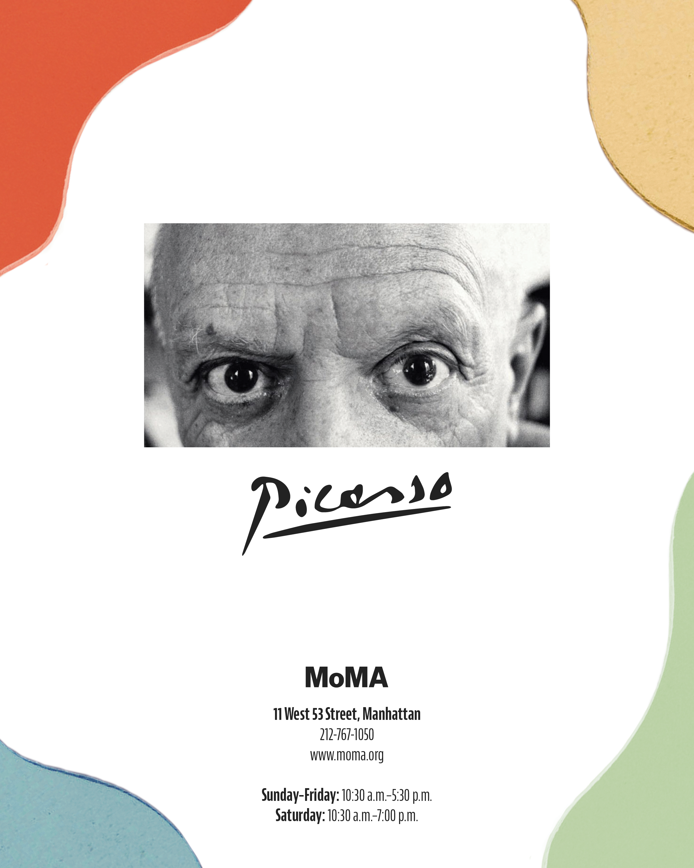
This booklet was made to be a guide for a fictional Pablo Picasso exhibition at MoMA. The main objective of this project was to combine the style of MoMA with the style of Picasso'‘s work. Combining the two styles was a challenge considering how different Picasso’s work is from MoMA minimalist design. The shapes that line the edges and corners of the pages are pieces from different Picasso paintings. The booklet begins with a brief introduction to Picasso, followed by a timeline of his life, descriptions of his work, and ends with a quote.
The typography in this booklet is on the simple side in order to let Picasso’s work shine and to match MoMA’s style as well. As for the color palette, all of the colors are from various Picasso paintings. The design and layout represent Picasso’s work, while still achieving the goal of complementing MoMA’s brand.
picasso exhibition boooklet


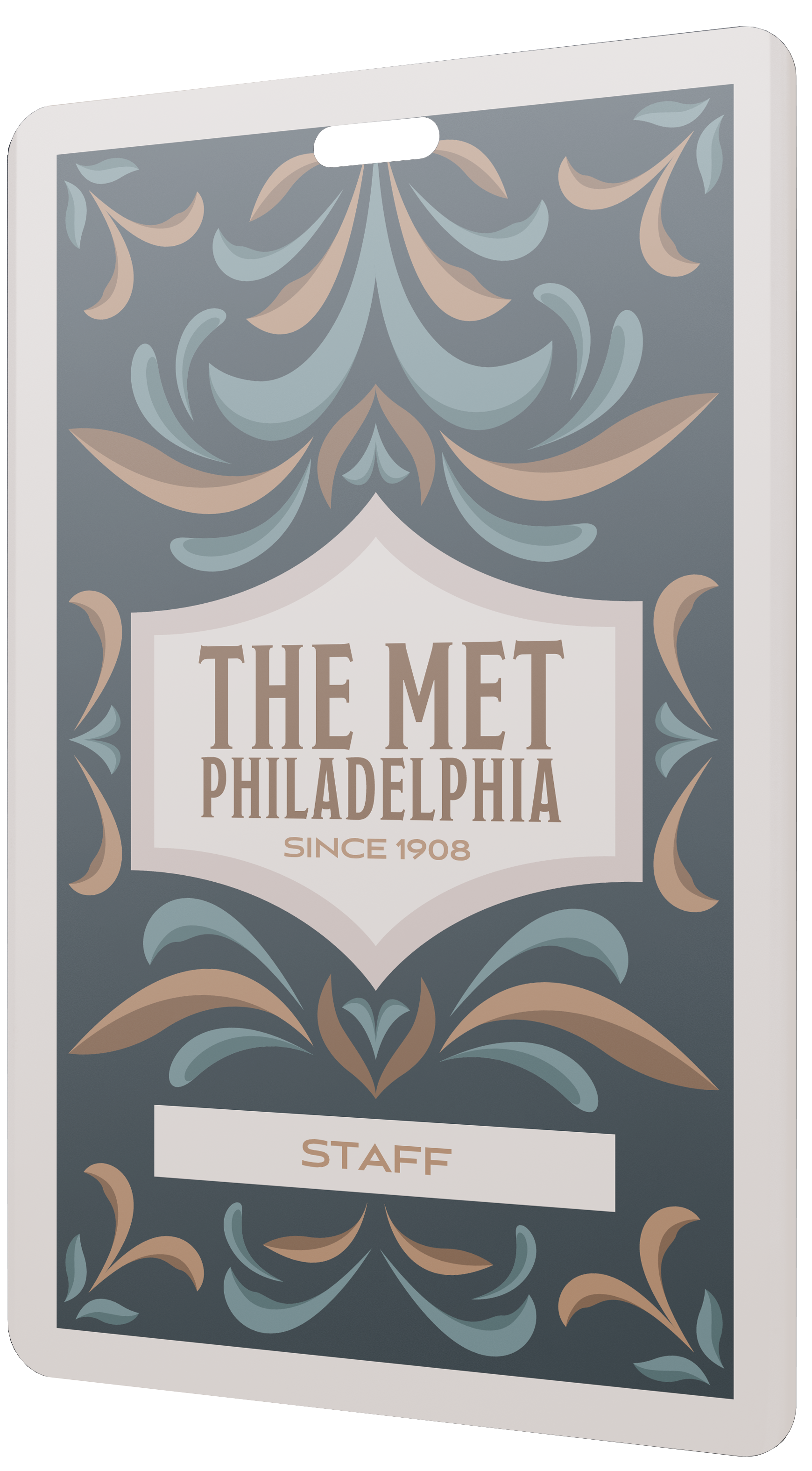
the met philly backstage pass
This backstage pass, made for the 2023 concert season, was designed for the staff of The Met Philly, also known as the Metropolitan Opera House. After being restored in 2018, this concert venue is one of the most popular in Philadelphia. While creating the pass, The Met expressed that they wanted a design inspired by the venue's history. Knowing the venue was originally opened in 1908 influenced the art-deco-style flourishes and typography.